
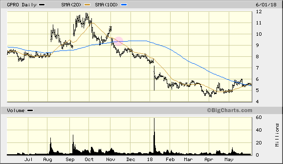
Death crosses are useful as trailing indicators. Specifically, a death cross occurs when the long term moving average passes above the short term moving average. The graph below depicts a death cross, highlighted in pink. It is a sign that the security is likely to fall in value.
Intuitively, this makes sense. The moving average is a trend over time. If the short term moving average falls below the long term moving average, it’s an indicator something has recently changed — for the worse.
Like any indicator, a death cross is far from foolproof. Since it’s a lagging indicator, if the downturn is short lived, by the time the indicator forms, the equity may have resumed an upward trend. In this instance, acting on the death cross is disadvantageous to the investor.
The opposite of a death cross is a golden cross. That is, a golden cross occurs if the short term moving average crosses above the long term average. A golden cross appears in the graph above in early August and is a sign of an upward trend.
Below are the results of a simple algorithm using death and golden crosses. The algorithm will go long on a golden cross and liquidate on a death cross.
Crosses really shine when used in conjunction with other indicators. The performance of crosses alone is far from groundbreaking.
Feel free to modify the algorithm on QuantConnect (GitHub). Changing the slow/fast period or symbol is a good place to start.
Have any algorithms that use crosses? A burning question I neglected to answer? Let me know in the comments!


Leave a Reply